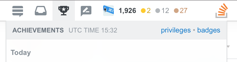
After much time in beta and quite a bit of testing, the new top nav is out, with many concerns unaddressed. I'm generally welcoming of change, such as the move to the new design across SE, but this top bar isn't ideal. I've written some CSS to try to make it look a little nicer. Some things have been rearranged to be closer to the original design — not just to make it closer to the original but because I preferred the original layout. Here's what it looks like:

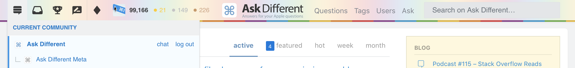
Updated for Stack Exchange: I've updated this post with a new stylesheet to apply to the rest of Stack Exchange now that the top bar is out elsewhere. This attempts to bring the new top bar more in line with Stack Overflow (integrating the navigation) and also rearranging the items like my prior stylesheet. Most of what I've written below applies here as well. You can find the new stylesheet below.
Here are the main problems I had with the existing bar:
- The height whilst being sticky. I have no problems with the height of the bar when it's static on a page, but being sticky means it simply takes up too much room on the page. I do like the nav being sticky, and even made the previous top bar sticky with a stylesheet, but with this sticky bar it simply takes up too much room.
- The actions are on the right hand side. This isn't in the normal viewing direction, which is just plain odd once you're logged in. Logged out, fair enough, but logged in, these are the most important buttons. I use the inbox and achievements dropdown modals constantly, which mean they need to be in the top-left.
- A ridiculous animation on search. Seriously, what is this? You click in the box, but unlike a normal search box animation which moves the end of the box, oh no, they move the start of the box. This completely repositions the insertion point at least the entire search box width away from where it started. Absolutely ridiculous. Clearly no-one uses the on-site search, mainly because Google exists, but it's still a useful feature which I do use especially for combining searches with tags, users or other advanced search features.
Things I've changed:
- It's a lot thinner. This means it can remain sticky without encroaching much on the content within.
- Actions are moved before the navigation. This means the inbox and such is on the left instead of the right, since I use these buttons more often. This was done with flex order, so no JavaScript required for actually manipulating the DOM.
- Individual actions themselves have been rearranged. The Stack Exchange button is now left-most. Again, this uses flex order.
- Search is no longer animated. Much less distracting, unlike having the insertion point move miles away from where it started.
- Each dropdown occupies the same position, rather than starting from a location relative to the button.

- The navigation fades very slightly on scroll. Only slightly. Feel free to disable this if you're not a fan, but I feel it makes the text blend better with the rest of the page when you're much less likely to use it.
- The logo and search box are slightly smaller to fit with the narrower bar. None of the other components had their text size or svg scale change.
- The new nav and dropdown boxes have a
-webkit-backdrop-filterapplied. If your browser is not compatible with this, you should remove it. Alpha without a blur looks awful. - The box shadow is applied constantly, not only on scroll. Having the shadow flicker on and off was pretty distracting for me, I'd rather it just be constant. It's not much of a shadow anyway.
- The header is sticky using
stickyand-webkit-sticky. This works better for me than usingfixed.
Here's the full Stack Overflow stylesheet:
.top-bar {
	height: 34px !important;
	position: sticky !important;
	position: -webkit-sticky !important;
	border-top: none !important;
	box-shadow: 0 1px 0 rgba(12, 13, 14, 0.1), 0 1px 3px rgba(12, 13, 14, 0.1), 0 4px 20px rgba(12, 13, 14, 0.035), 0 1px 1px rgba(12, 13, 14, 0.025) !important;
	-webkit-backdrop-filter: blur(20px);
	background: rgba(255, 255, 255, 0.8) !important;
}
.top-bar .-main {
	order: 2;
}
.top-bar .-logo {
	height: 40px !important;
	transform: scale(.85);
	margin-left: -25px !important;
}
.top-bar .navigation {
	max-width: unset !important;
	opacity: 1 !important;
}
.top-bar .navigation .beta-badge {
	top: 22px !important;
}
.top-bar._scrolling .navigation {
	opacity: .8 !important;
}
.top-bar .secondary-nav .-link {
	height: 35px !important;
	padding-top: 0 !important;
}
.top-bar .searchbar {
	order: 2;
	margin-left: 20px;
	margin-right: 10px;
}
.top-bar .searchbar>[role="icon"] {
	transform: scale(.7) translateY(-70%) !important;
	margin-left: -8px !important;
	opacity: 1 !important;
}
.top-bar .searchbar input[type="text"].f-input {
	height: 26px !important;
	padding-left: 25px !important;
	padding-top: 9px !important;
}
.top-bar .searchbar .btn {
	transform: scale(.6) translateY(-82%) translateX(11px) !important;
}
.top-bar .-actions {
	order: 1;
	padding: 0;
	height: 36px !important;
	margin-left: -8px !important;
	margin-right: 48px !important;
}
.top-bar .my-profile {
	order: 1;
	height: 34px !important;
}
.top-bar .my-profile .gravatar-wrapper-24 .-avatar {
	height: 18px;
	width: 18px;
}
.top-bar .secondary-nav .-list .-item:not(:last-of-type) {
	order: 1;
}
.top-bar .secondary-nav .-list .-item:last-of-type {
	order: 0;
}
.top-bar .secondary-nav .-list .-item:first-of-type {
	order: 2; /*SOX*/
}
.top-bar ~ .container {
	margin-top: 0px !important;
}
.topbar-dialog, #sox-settings-dialog.topbar-dialog.achievements-dialog.dno.new-topbar {
	left: 6px !important;
	top: 34px !important;
	background: rgba(255, 255, 255, 0.8) !important;
	-webkit-backdrop-filter: blur(20px);
}
If you use SOX, append the following to keep the action buttons in the correct order.
.top-bar .secondary-nav .-list .-item:first-of-type {
	order: 2;
}
Here's the equivalent stylesheet for the rest of Stack Exchange:
.top-bar {
	position: fixed;
	top: 0;
	z-index: 9;
	-webkit-backdrop-filter: blur(20px);
	background: rgba(255, 255, 255, 0.8) !important;
	box-shadow: 0 1px 5px rgba(0, 0, 0, 0.26);
}
.top-bar .-actions {
	order: -1;
	margin-left: 0;
	padding-left: 0;
}
.top-bar .secondary-nav:last-child {
	order: -1;
	margin-left: -16px;
}
.top-bar .-item:nth-child(4) {
	order: -1;
}
.top-bar .-item path {
	fill: rgba(12, 13, 14, 0.8) !important;
}
.top-bar .my-profile {
	color: rgba(12, 13, 14, 0.8) !important;
}
.top-bar .-item .-link:hover, .top-bar .my-profile:hover {
	background-color: #d6d9dc !important;
	color: rgba(12, 13, 14, 0.8) !important;
}
.top-bar .-logo svg {
	visibility: hidden;
}
.top-bar .-logo::before {
	display: block;
	background-image: url("https://cdn.sstatic.net/Sites/apple/img/sprites.svg"); /* change for sites other than Ask Different */
	background-position: top left;
	background-repeat: no-repeat;
	background-size: 13rem;
	width: 10rem;
	height: 2rem;
	content: "";
}

#hlogo, #hmenus li:nth-child(4), #hmenus li:nth-child(5) {
	display: none;
}
#header {
	height: 16px;
}
#hmenus {
	z-index: 9;
	top: -32px;
	right: 300px;
}
.nav ul li {
	margin: 0 -15px 0 0 !important;
}

#nav-askquestion {
	text-indent: -9999px;
	line-height: 0;
	width: 26px;
}
#nav-askquestion::after {
	content: "Ask";
	text-indent: 0;
	display: block;
	line-height: initial;
}

.top-bar .searchbar {
	margin-left: 120px;
}
.top-bar .searchbar input {
	font-size: 12px;
}

.topbar-dialog {
	left: -2px !important;
	background: rgba(255, 255, 255, 0.8) !important;
	-webkit-backdrop-filter: blur(20px);
}
Leave a Reply